Step into a world of tranquility and elegance with blue wallpaper. This versatile and timeless colour option has the power to transform any space into a serene oasis. Whether you want to create a soothing atmosphere in your bedroom, a touch of sophistication to your living room or playful charm to a child's bedroom, blue wallpaper is the perfect choice.

Discovering the Versatility of Blue Wallpaper
From soft, pastel hues to deep, bold tones, you can find the perfect shade to match your personal style and enhance the overall aesthetic of your space. Whether you prefer a classic stripe, a contemporary geometric pattern, or whimsical character there is a blue wallpaper design to suit every taste.

The Psychology of Blue
Blue wallpaper is more than just a design choice; it's a psychological powerhouse for your space. Known for its calming effect on the mind and body, blue is synonymous with peace, relaxation, and stability. This makes it an ideal option for creating serene atmospheres in areas like bedrooms, meditation rooms, or home offices.
But blue isn't just about relaxation—it's also a catalyst for creativity and productivity. Its ability to encourage clear thinking and focus makes it perfect for workspaces or areas dedicated to creative activities such as painting or writing.
When selecting blue wallpaper, consider the shade's impact on the ambiance. Lighter shades like powder blue or sky blue can open up smaller rooms, while darker tones like navy or indigo add depth and sophistication to larger spaces with ample natural light.
In essence, blue wallpaper offers a dynamic blend of tranquility and stimulation, transforming any room into a haven of creativity and calm.

Benefits of using blue wallpaper in your space
Using blue wallpaper in your space offers a multitude of benefits beyond its calming and soothing properties. Here are some additional advantages that make blue wallpaper an excellent choice for transforming your space:
1. Versatility: Blue wallpaper comes in a wide range of patterns and shades, allowing you to create a look that suits your style and preferences. Whether you prefer a traditional floral pattern or a more modern geometric design, there is a blue wallpaper option to complement any interior design theme.


2. Timelessness: Unlike trendy colors that may go out of style quickly, blue is a classic colour that stands the test of time. Incorporating blue wallpaper into your space ensures that your interior design remains relevant and stylish for years to come.
3. Easy coordination: Blue is a colour that pairs well with a variety of other colors, making it easy to coordinate your furniture, curtains, and accessories with your blue wallpaper. Whether you prefer a monochromatic look or want to add pops of colour, blue provides a versatile base that allows for endless styling possibilities.
Choose the right blue wallpaper for you.

Wiggly Squiggly creates a sense of calmness and serenity with its light blue tone making the room feel airy and spacious. It's playful tone is perfect for a bathroom or childs bedroom.

Navy blue is a rich, deep shade that exudes elegance and sophistication. It is often associated with luxury and works well in formal spaces such as dining rooms or home offices. Navy blue wallpaper can create a dramatic and stylish look, especially when paired with metallic accents or bold patterns.

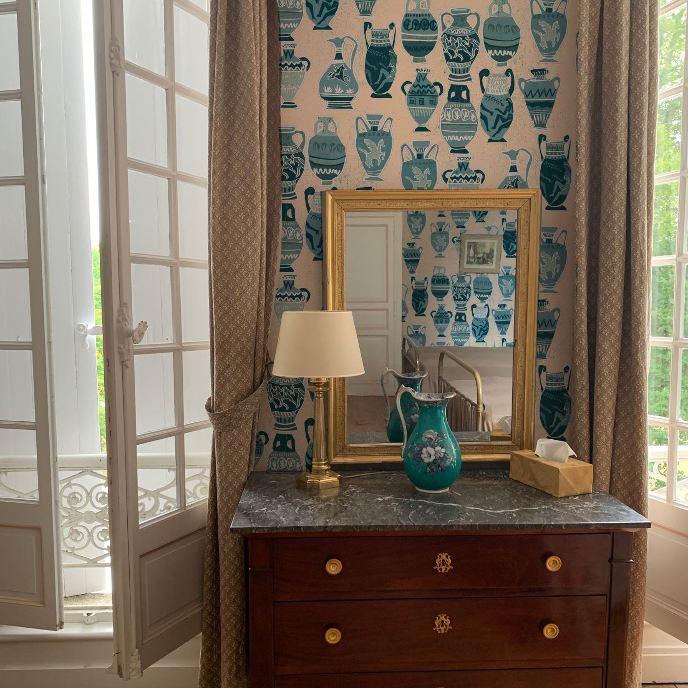
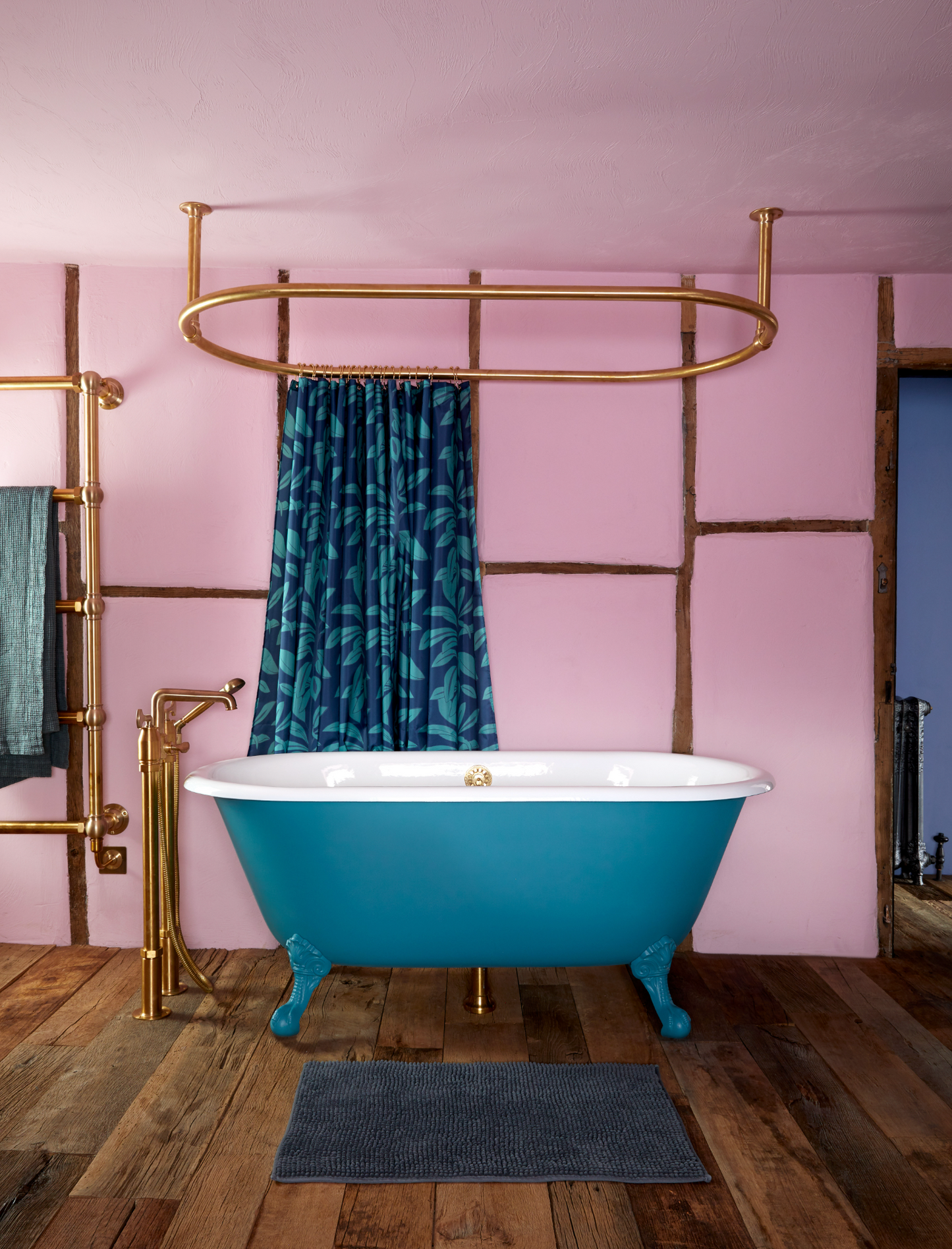
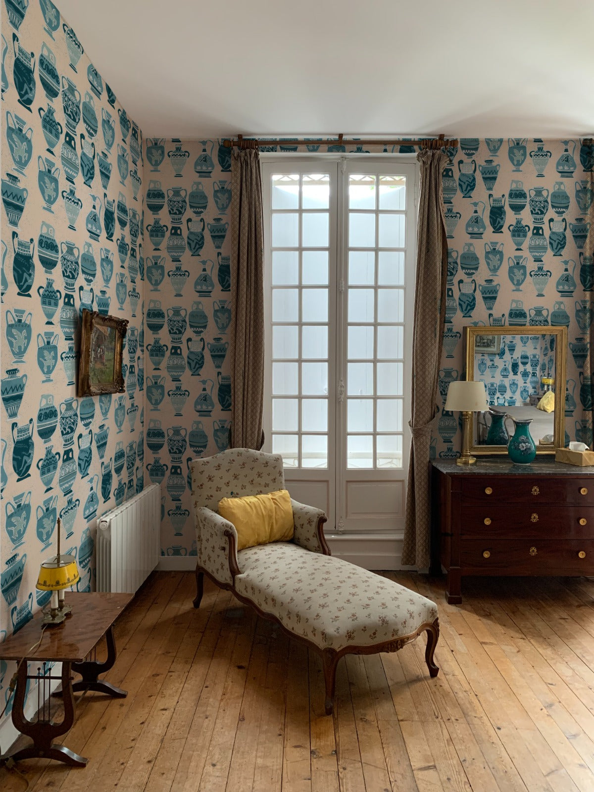
Teal blue is a vibrant and refreshing shade that combines elements of blue and green. It is a versatile color that can add a pop of color to any space while still maintaining a sense of tranquility. Teal blue wallpaper works well in living rooms, bathrooms or kitchens, where you want to create an energetic and inviting atmosphere.

Powder Blue: Powder blue is a soft and delicate shade that evokes a sense of innocence and purity. creating a dreamy and whimsical atmosphere, perfect for creating a calm and serene environment.

When choosing the shade of blue for your space, consider the existing furniture and decor and how they will interact with the blue wallpaper. Consider the overall aesthetic you want to achieve and how the blue wallpaper will contribute to the desired ambiance.
